
national geographic society
national geographic society
ROLE
ROLE
Ui DESIGN
UX DESIGN, STRATEGY, RESEARCH
type
type
responsive web app
responsive web app


project overview
project overview
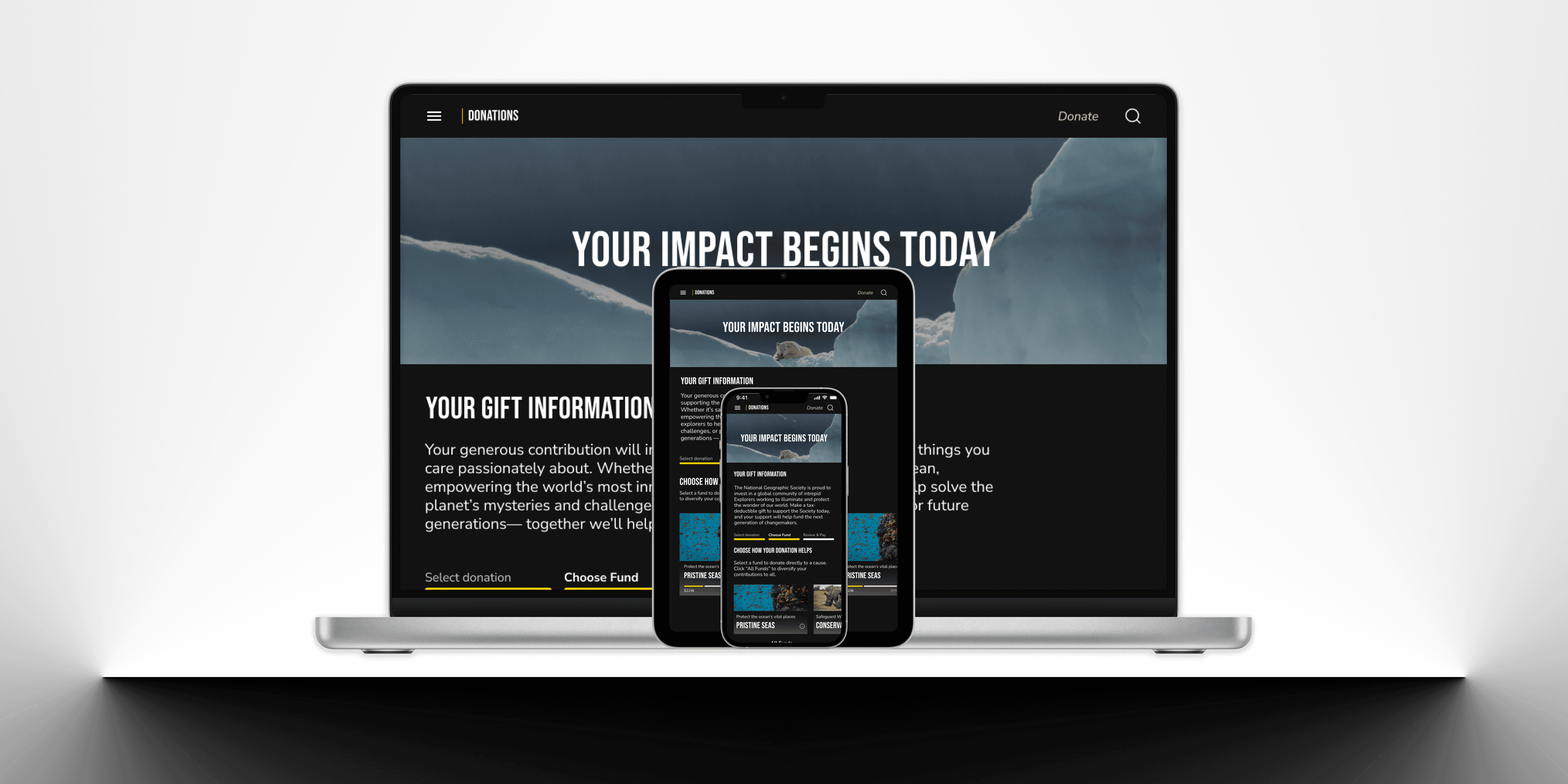
As the UI Designer for the redesign project of National Geographic Society’s web app, I I focused on transforming the digital experience by identifying weaknesses in the interface and creating a more streamlined, visually engaging design. My work involved optimizing the layout, improving readability, aligning with the native app, and incorporating bold design elements to enhance usability and deliver a more immersive, brand-consistent experience.
As the UI Designer for the redesign project of National Geographic Society’s web app, I I focused on transforming the digital experience by identifying weaknesses in the interface and creating a more streamlined, visually engaging design. My work involved optimizing the layout, improving readability, aligning with the native app, and incorporating bold design elements to enhance usability and deliver a more immersive, brand-consistent experience.
Reasons for redesign
Reasons for redesign
Reasons for redesign
Encourage Interactivity
Encourage Interactivity
Original design lacked dynamic, engaging elements to persuade users to get involved with initiatives
Reduce Cognitive Load
Reduce Cognitive Load
Pages were overwhelmed with too much text making it hard for users to digest information
Pages were overwhelmed with too much text making it hard for users to digest information
Increase Responsiveness
Increase Responsiveness
Navigation was clunky and unintuitive when scaling between device sizes
Navigation was clunky and unintuitive when scaling between device sizes
Leverage Visual Appeal
Leverage Visual Appeal
Various screens lacked dynamic, engaging elements that play into the brand's bold narrative
Various screens lacked dynamic, engaging elements that play into the brand's bold narrative
Encourage Interactivity
Original design lacked dynamic, engaging elements to persuade users to get involved with initiatives
Reduce Cognitive Load
Pages were overwhelmed with too much text making it hard for users to digest information
Increase Responsiveness
Navigation was clunky and unintuitive when scaling between device sizes
Leverage Visual Appeal
Various screens lacked dynamic, engaging elements that play into the brand's bold narrative
user flows
user flows
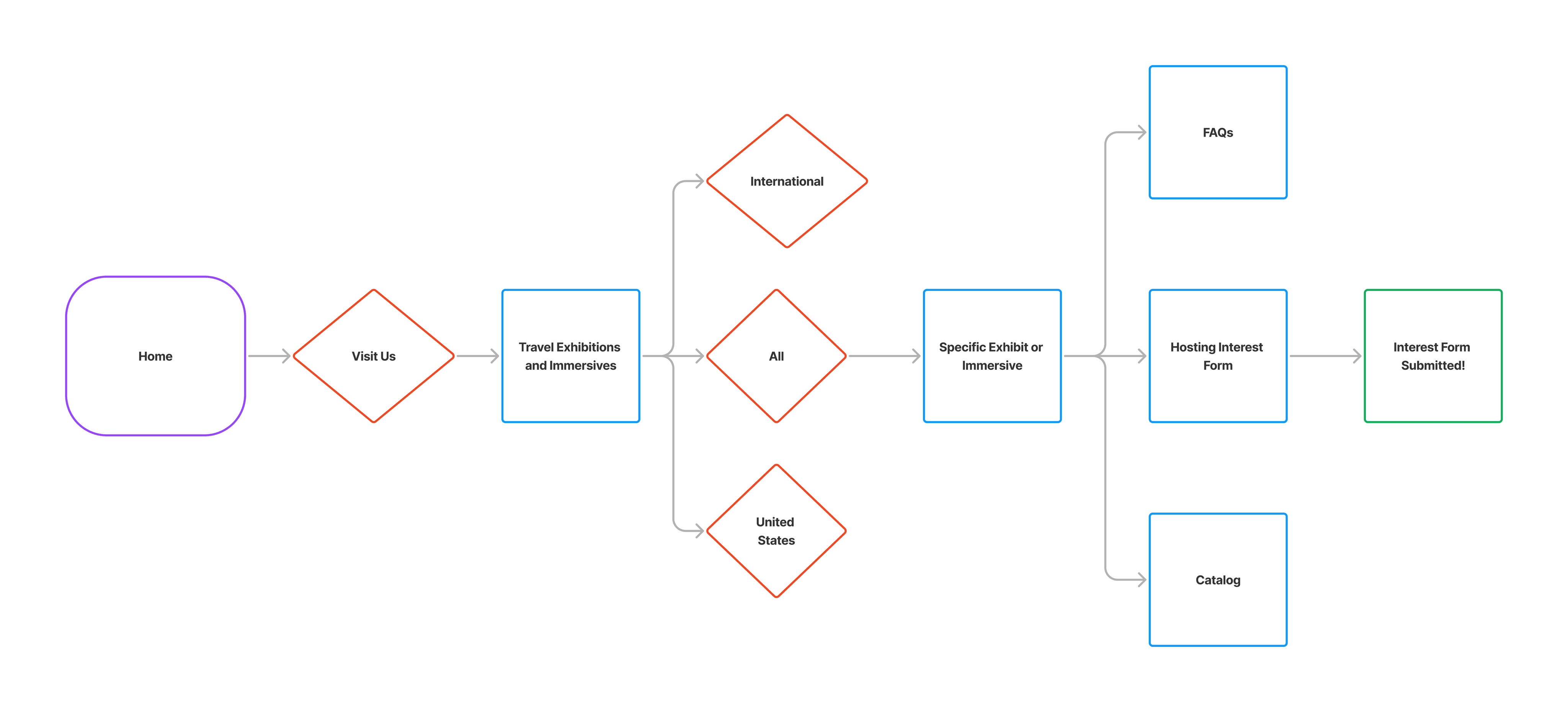
As a user interested in National Geographic Society exhibits, I want a visually engaging and easy-to-digest page layout, so that I can quickly understand key information without feeling overwhelmed by too much text.
As a user interested in National Geographic Society exhibits, I want a visually engaging and easy-to-digest page layout, so that I can quickly understand key information without feeling overwhelmed by too much text.
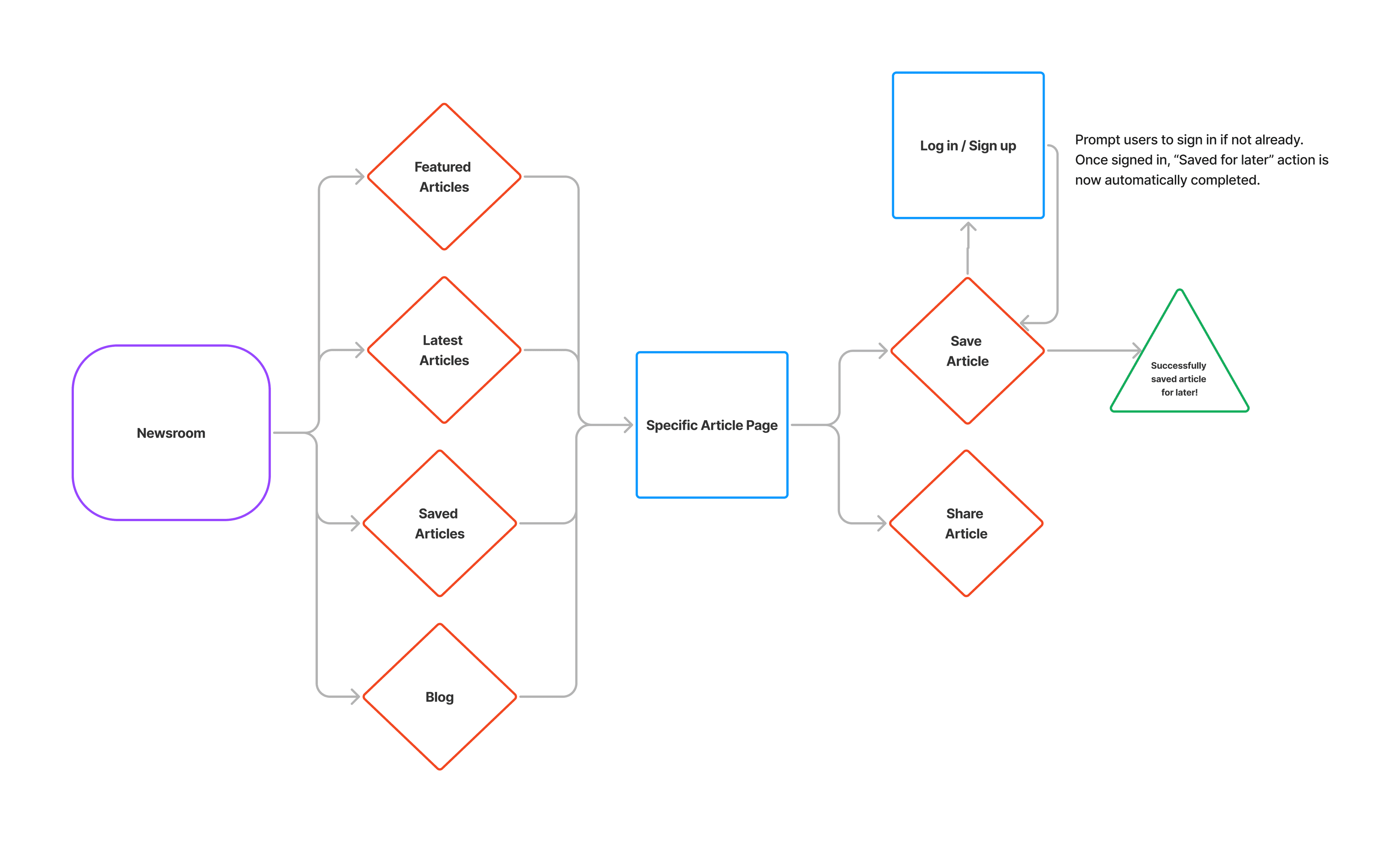
As a reader exploring National Geographic articles, I want to save articles for later, so that I can return to read them at my convenience without losing track of interesting content.
As a reader exploring National Geographic articles, I want to save articles for later, so that I can return to read them at my convenience without losing track of interesting content.


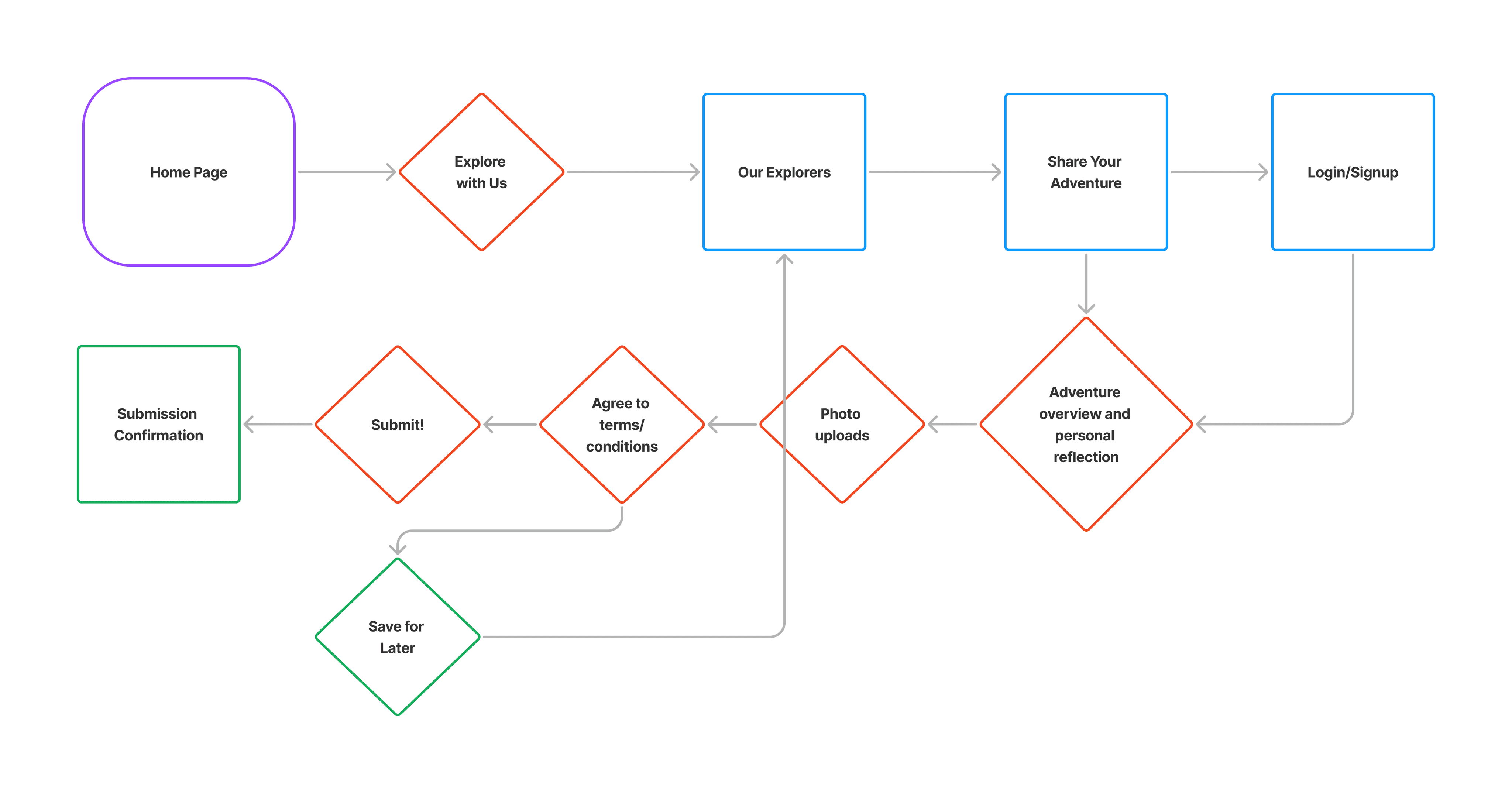
As a National Geographic Society enthusiast who loves exploration, I want to share my own adventures and stories with the community, so that I can connect with other explorers and contribute to the platform in a meaningful way.
As a National Geographic Society enthusiast who loves exploration, I want to share my own adventures and stories with the community, so that I can connect with other explorers and contribute to the platform in a meaningful way.


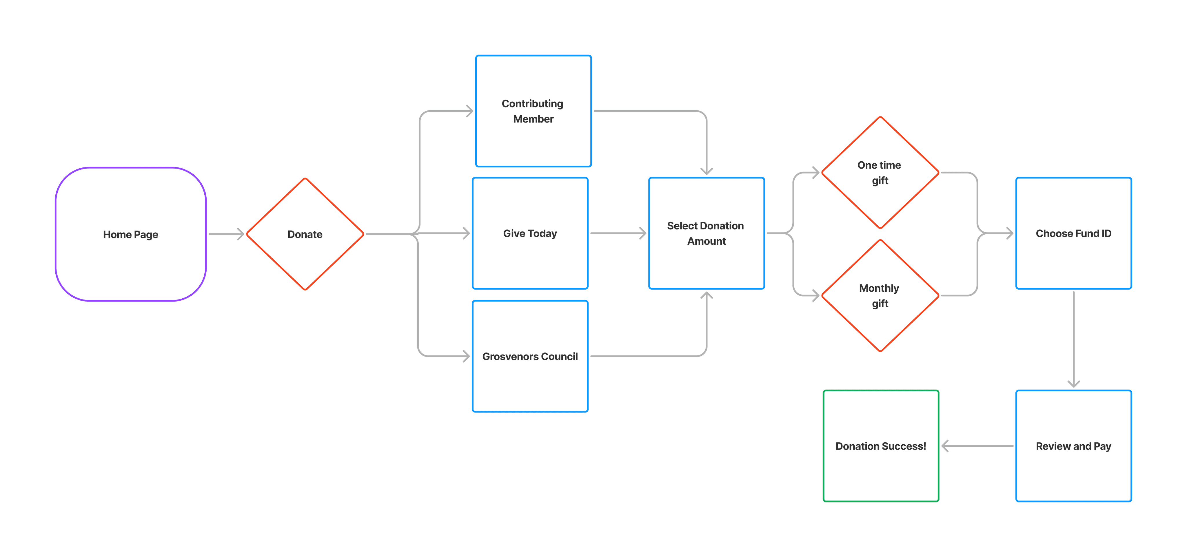
As a potential Society donor, I want a single, core space to donate in multiple ways and to see how my monetary contributions contribute to their mission.
As a potential Society donor, I want a single, core space to donate in multiple ways and to see how my monetary contributions contribute to their mission.


mid fidelity wireframes
mid fidelity wireframes
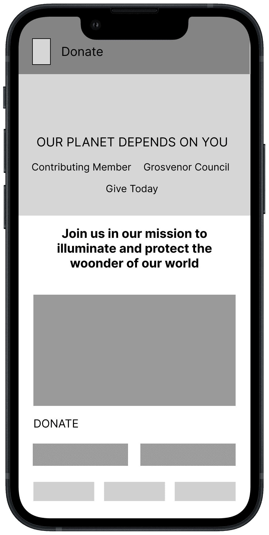
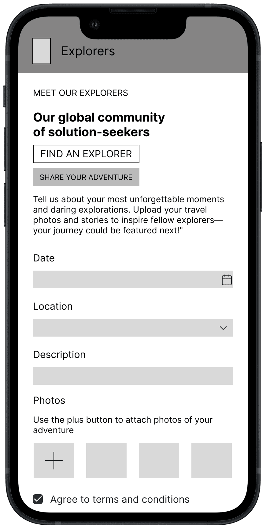
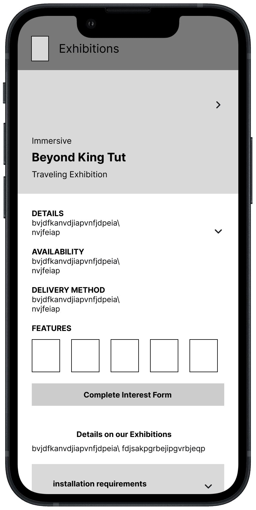
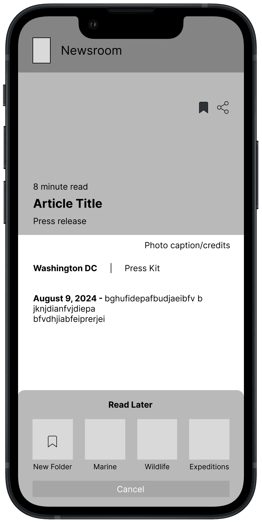
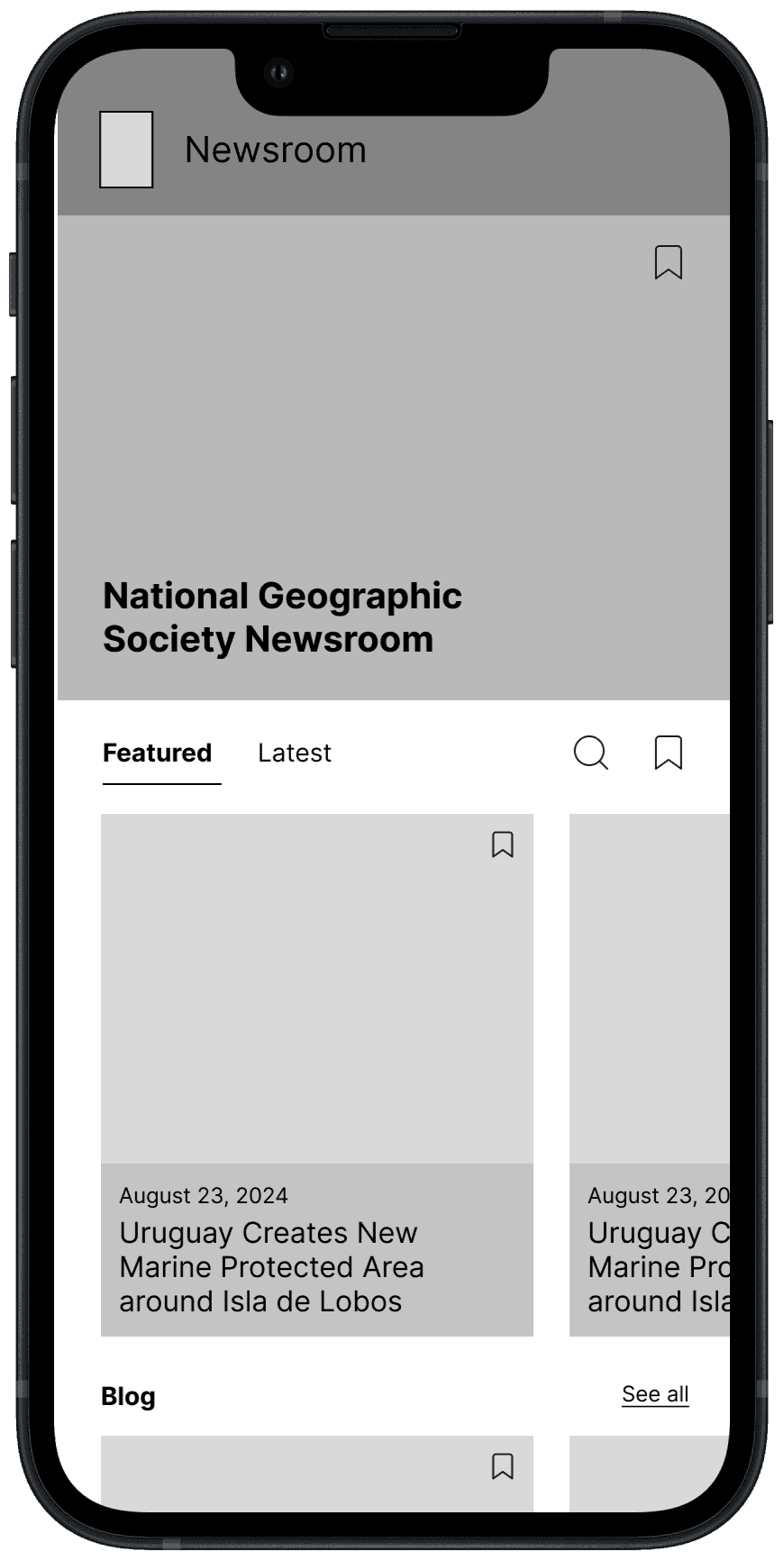
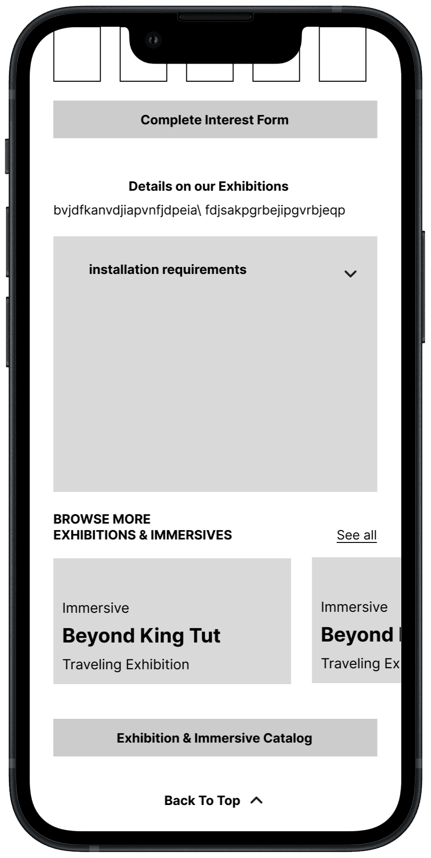


low & mid fidelity wireframes


View more wireframing and mid-fidelity design patterns here:
View more wireframing and mid-fidelity design patterns here:
DOWNLOAD
DOWNLOAD
style guide
style guide
Whether it's stunning photography, powerful stories, or engaging interactive features, the redesigned Style Guide allows the content to take center stage without unnecessary distractions. By stripping down the design to its essential elements, the redesign creates a clean and focused user experience that emphasizes clarity and ease of navigation. This aesthetic also mirrors the bold and adventurous spirit of National Geographic Society, highlighting exploration and discovery in a way that feels modern and impactful.
Whether it's stunning photography, powerful stories, or engaging interactive features, the redesigned Style Guide allows the content to take center stage without unnecessary distractions. By stripping down the design to its essential elements, the redesign creates a clean and focused user experience that emphasizes clarity and ease of navigation. This aesthetic also mirrors the bold and adventurous spirit of National Geographic Society, highlighting exploration and discovery in a way that feels modern and impactful.
style guide
Whether it's stunning photography, powerful stories, or engaging interactive features, the redesigned Style Guide allows the content to take center stage without unnecessary distractions. By stripping down the design to its essential elements, the redesign creates a clean and focused user experience that emphasizes clarity and ease of navigation. This aesthetic also mirrors the bold and adventurous spirit of National Geographic Society, highlighting exploration and discovery in a way that feels modern and impactful.
moodboard
moodboard
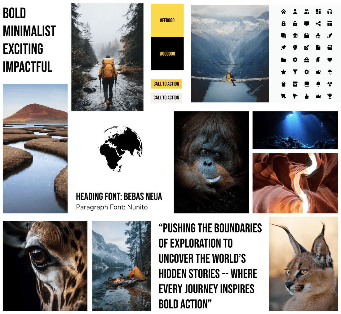


moodboard

Color palette
Color palette
I ultimately decided to keep National Geographic’s iconic yellow for brand consistency and recognition, as it represents exploration and discovery. However, I shifted to dark mode for a bolder, more striking design that enhances contrast and makes the yellow pop. With dark mode's rising popularity for its modern look and user comfort, this choice aligns with current user preferences for a more engaging experience.
I ultimately decided to keep National Geographic’s iconic yellow for brand consistency and recognition, as it represents exploration and discovery. However, I shifted to dark mode for a bolder, more striking design that enhances contrast and makes the yellow pop. With dark mode's rising popularity for its modern look and user comfort, this choice aligns with current user preferences for a more engaging experience.
#FFD800
Primary Yellow
Primary Yellow
#121212
Black (Background)
Black (Background)
#FFFFFF
White (Text)
White
(Text)
#FFEEA8
Secondary Yellow
Secondary Yellow
#565656
Neutral Variation
Neutral Variation
##CBCBCB
Neutral Variation
Neutral Variation
typography
typography
I chose Bebas Neue for headings due to its clean, all-caps style, conveying strength and clarity that aligns with National Geographic’s adventurous spirit. For body text, I selected Nunito Sans for its readability and modern, approachable feel, creating a balanced contrast with Bebas Neue for an engaging yet easy-to-read design.
I chose Bebas Neue for headings due to its clean, all-caps style, conveying strength and clarity that aligns with National Geographic’s adventurous spirit. For body text, I selected Nunito Sans for its readability and modern, approachable feel, creating a balanced contrast with Bebas Neue for an engaging yet easy-to-read design.
heading font: Bebas Neua
Paragraph Font: Nunito Sans
Heading 1(2.986rem/48px)
Heading 2 (2.488rem/40px)
heading 3 (2.074rem/33px)
heading 4 (1.728rem/28px)
heading 5 (1.440rem/23px)
heading 6 (1.200rem/19px)
Body/Paragraph 1 (1.200rem / 20px)
Body/Paragraph 2 (1.200REM / 16px)
high fidelity wireframes
high fidelity wireframes
high fidelity wireframes
Building upon my style guidelines, I iterated from the low and mid-fidelity wireframes, refining the interface and enhancing user experience in high-fidelity wireframes.
Building upon my style guidelines, I iterated from the low and mid-fidelity wireframes, refining the interface and enhancing user experience in high-fidelity wireframes.






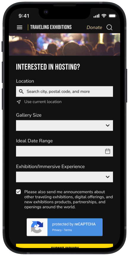


before & afters
before & afters
Encouraging Interactivity
Encouraging Interactivity
Original:
Offers little user engagement
Interaction only includes reading static content of explorers
Accessing specific explorers leads to cumbersome and outdated directory
Original:
Offers little user engagement
Interaction only includes reading static content of explorers
Accessing specific explorers leads to cumbersome and outdated directory
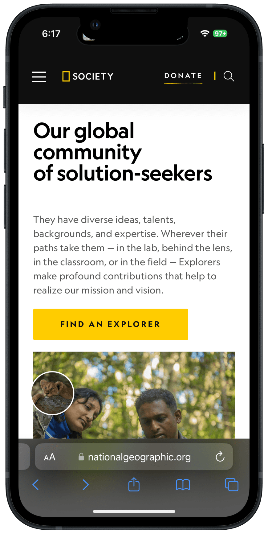
Redesign:
New 'Share Your Adventure' feature invites users to engage with the brand
Fosters deeper community connection
Upon clicking 'Share Your Adventure,' users are seamlessly guided through a form to submit their experiences
Explorer preview cards spark curiosity and encourage further exploration into National Geographic’s inspiring figures.
Original

Redesign
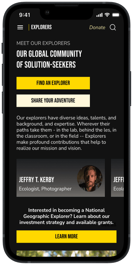


Reducing Cognitive Overload
Original:
Overwhelmed with excessive, static text
Exhibit sections are non-interactive, leaving users unclear about event details
Fails to evoke excitement or curiosity
Original:
Overwhelmed with excessive, static text
Exhibit sections are non-interactive, leaving users unclear about event details
Fails to evoke excitement or curiosity
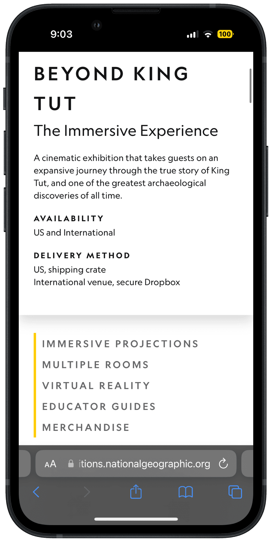
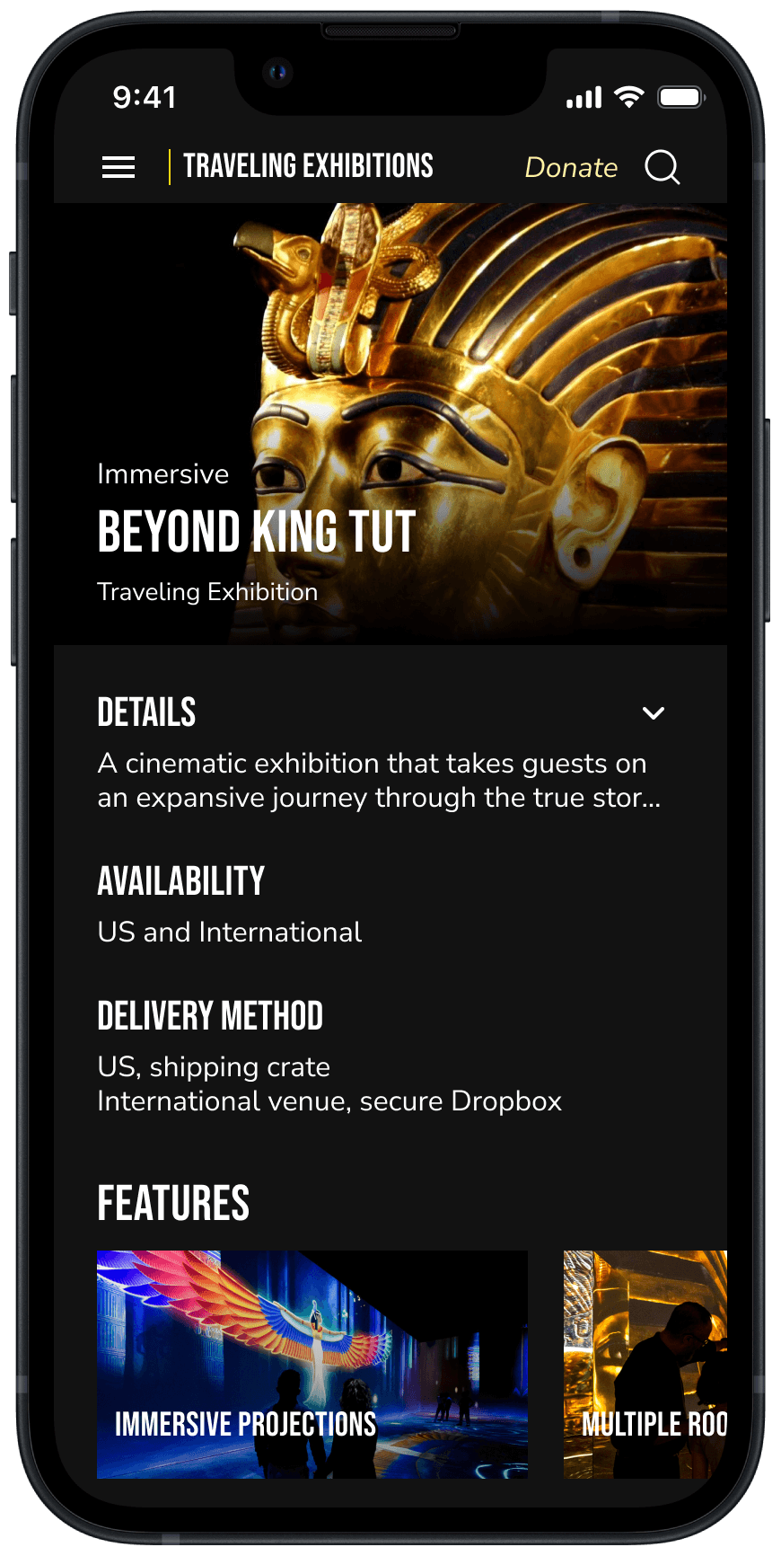
Redesign:
Collapsible 'Details' section reduces text
'Features' section with horizontal scrolling for easy exploration of exhibit details
Black background for a bold atmosphere
Redesign:
Collapsible 'Details' section reduces text
'Features' section with horizontal scrolling for easy exploration of exhibit details
Black background for a bold atmosphere
Original

Redesign


Inspiring Generosity
Original:
No option for users to select a specific initiative to support, leading to uncertainty about where their donation is going.
After selecting a donation amount, users immediately scroll to the payment form, bypassing any further context/explanation.
Original:
No option for users to select a specific initiative to support, leading to uncertainty about where their donation is going.
After selecting a donation amount, users immediately scroll to the payment form, bypassing any further context/explanation.
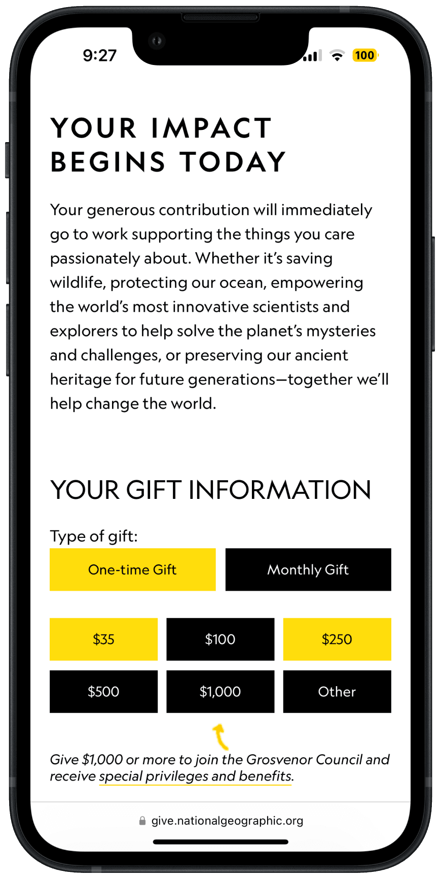
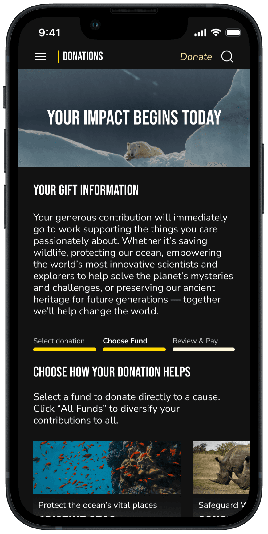
Redesign:
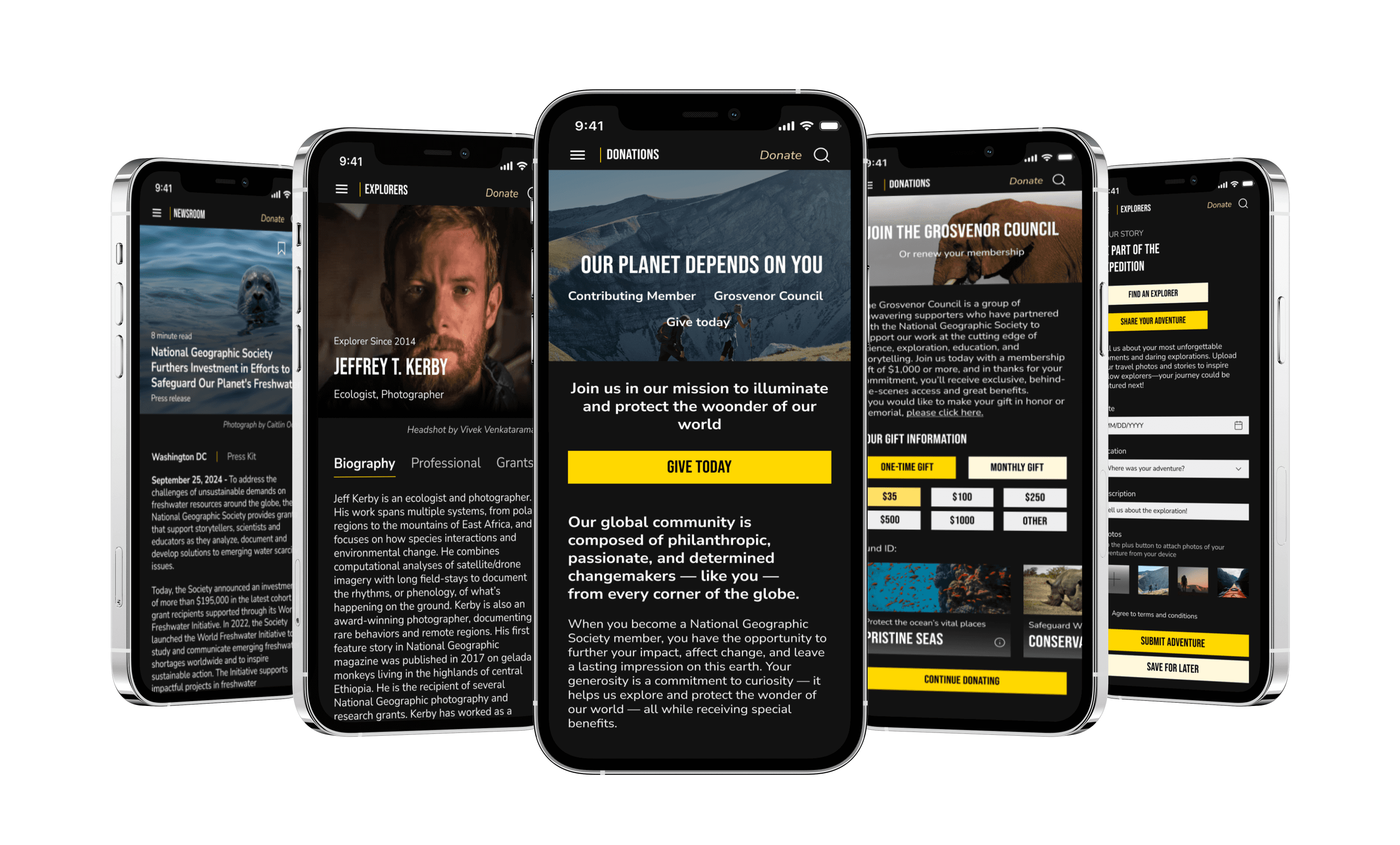
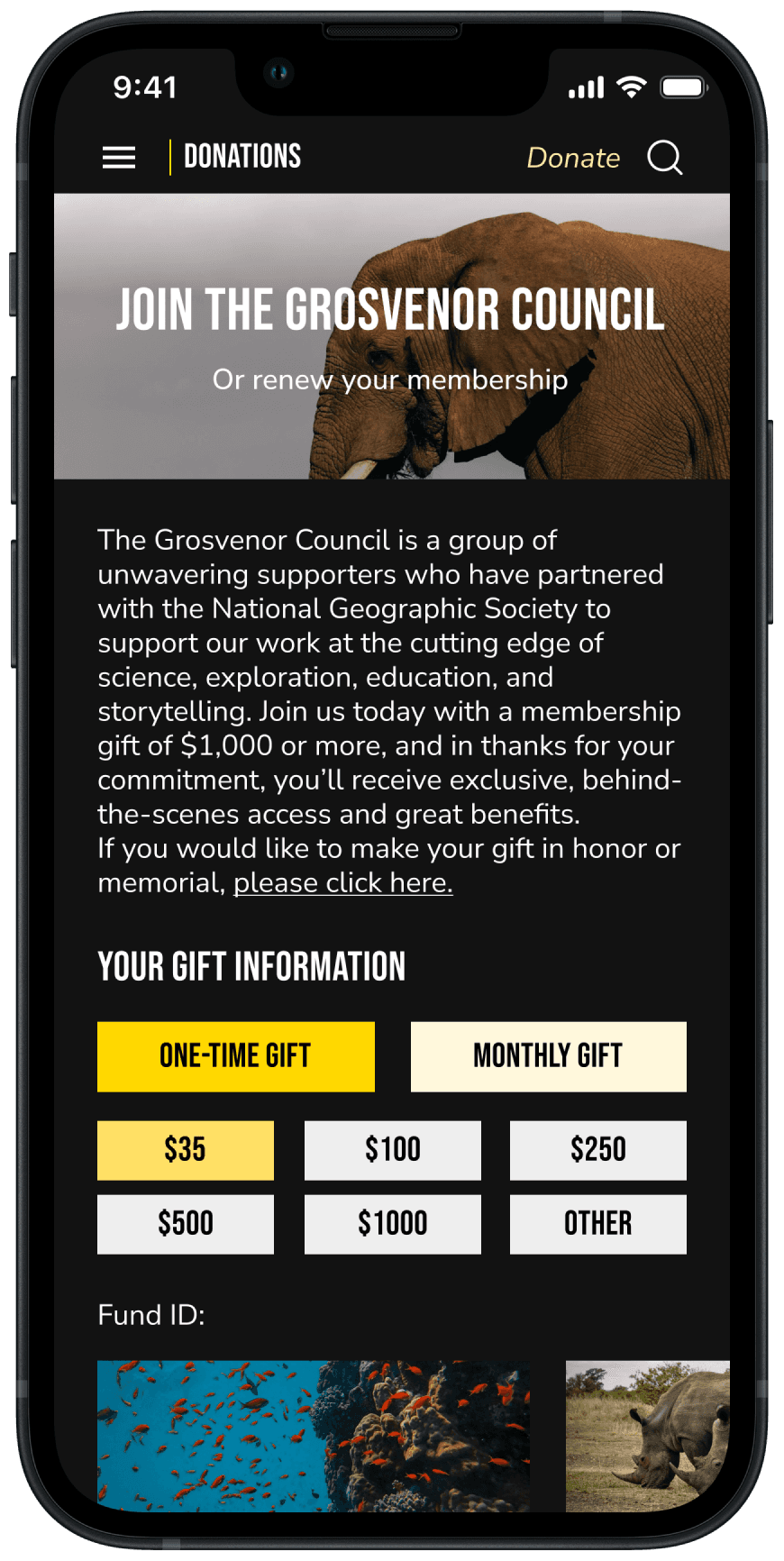
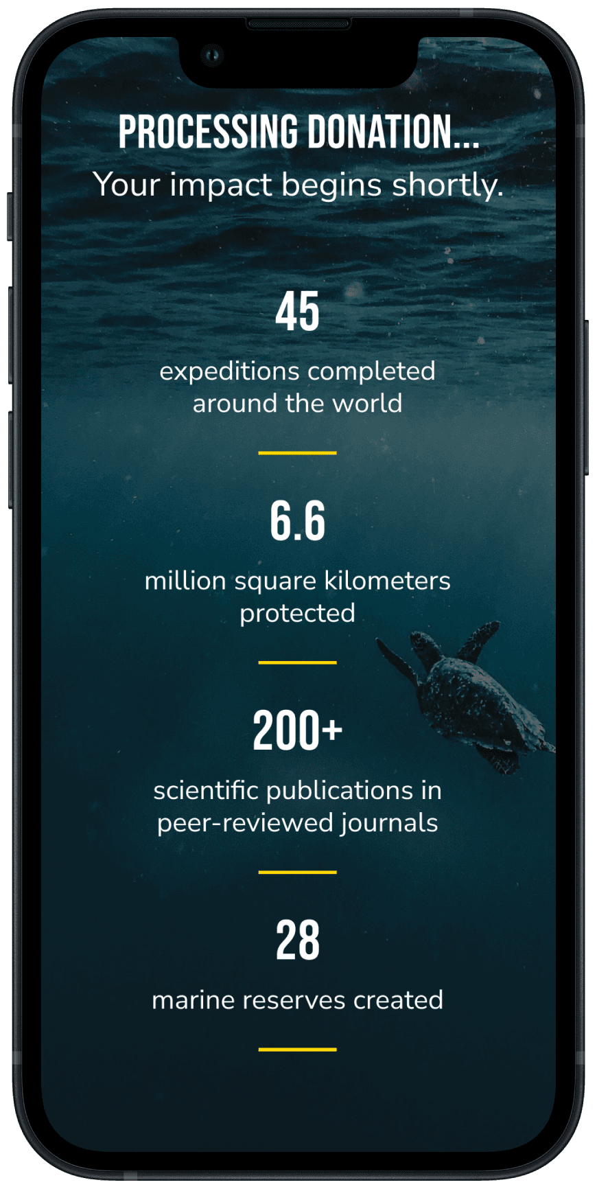
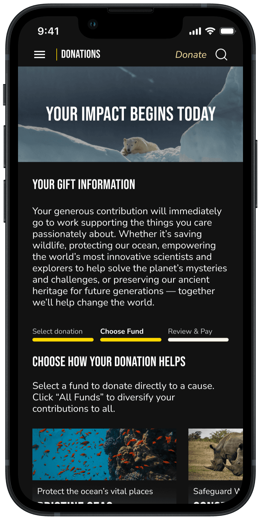
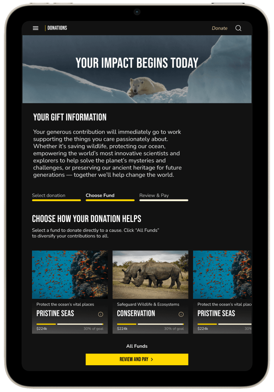
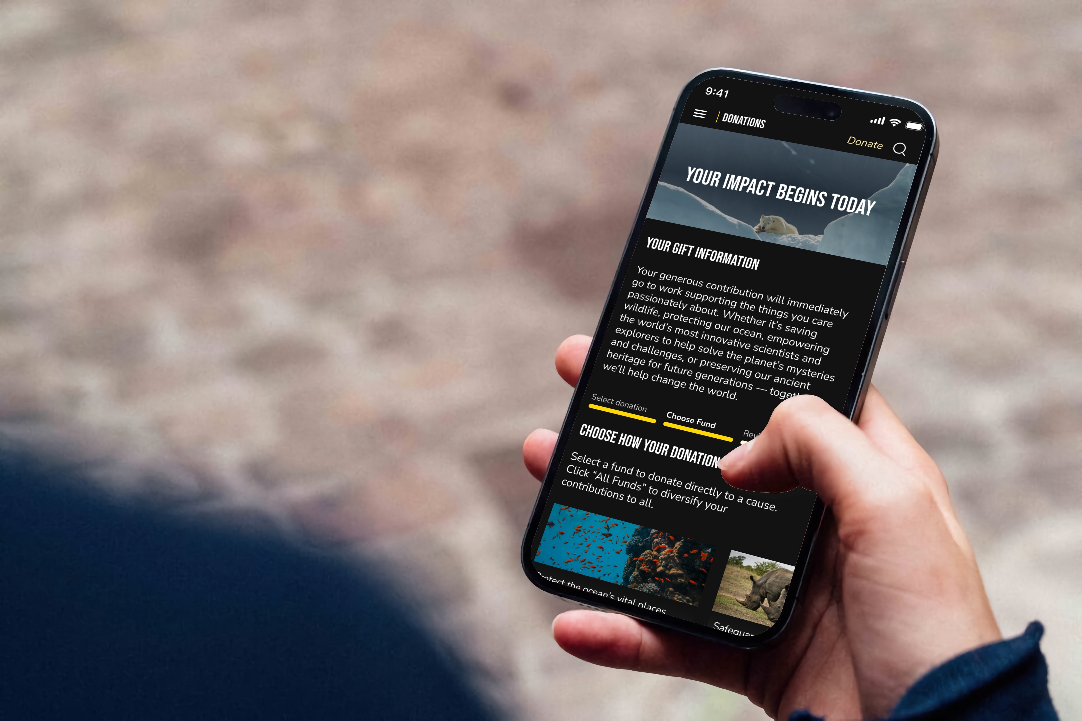
Introduced "Choose How Your Donation Helps" feature, allowing users to select the specific fund they want to support.
Simplified donation process into 3 clear, progressive steps to make it more user-friendly and less overwhelming.
Incorporated compelling imagery to evoke empathy and inspire users to contribute.
Original

Redesign


Curating Experiences
Original:
Displays only one article at a time, limiting visibility of multiple headlines
No option to save articles for later
Lacks sorting functionality for easy navigation of different articles
Original:
Displays only one article at a time, limiting visibility of multiple headlines
No option to save articles for later
Lacks sorting functionality for easy navigation of different articles
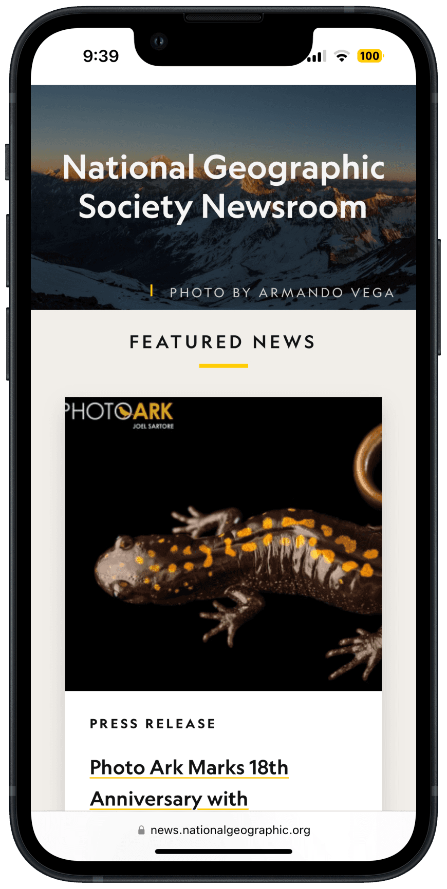
Redesign:
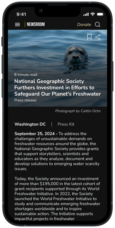
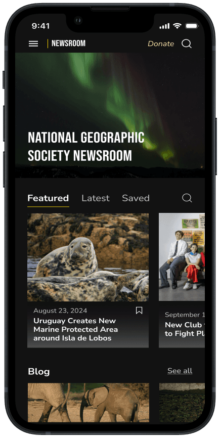
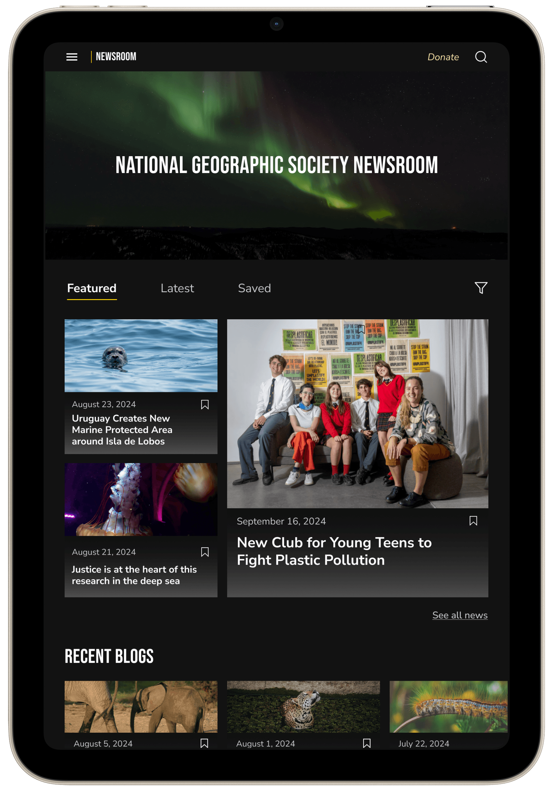
Horizontal scrolling enables viewing multiple articles on a single screen
Introduced "Bookmark" feature for saving articles to come back to
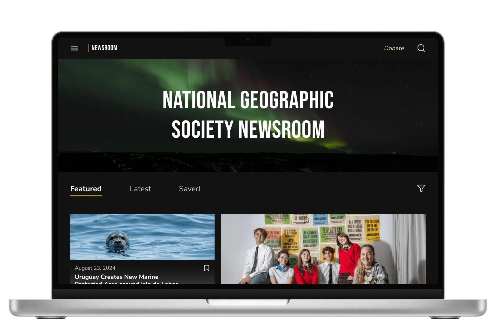
Users can now sort articles by featured, latest, saved, or all categories
Redesign:
Horizontal scrolling enables viewing multiple articles on a single screen
Introduced "Bookmark" feature for saving articles to come back to
Users can now sort articles by featured, latest, saved, or all categories
Original

Redesign

responsive design
IDEATE
responsive design
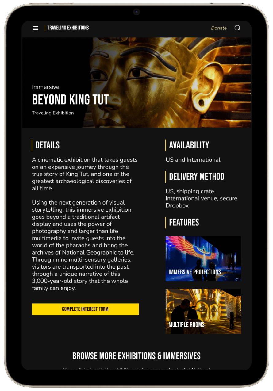
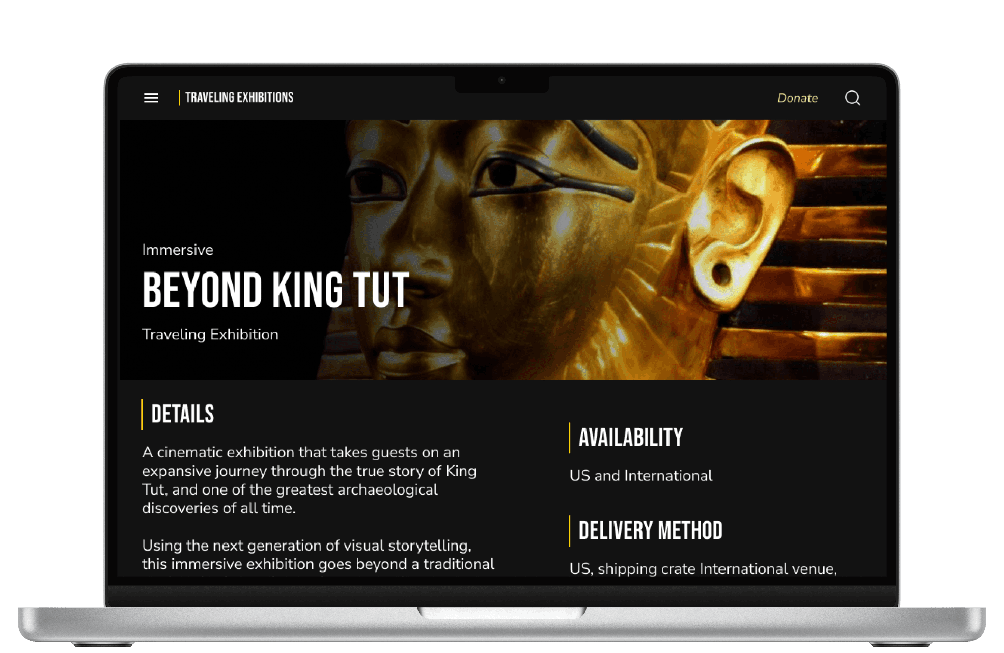
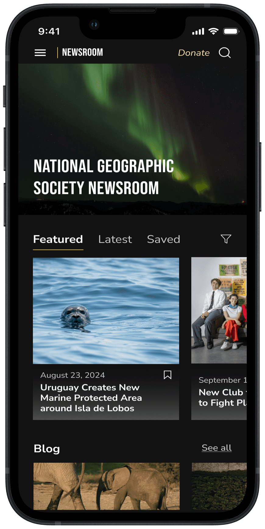
Originally, many screens of the site lacked responsiveness across desktop, tablet, and mobile devices. By employing a mobile-first design strategy, I was able to optimize the user experience across all screen sizes. This approach ensures that users enjoy a seamless and engaging interaction with The Society's content, regardless of the device they are using, enhancing accessibility and overall satisfaction.
Originally, many screens of the site lacked responsiveness across desktop, tablet, and mobile devices. By employing a mobile-first design strategy, I was able to optimize the user experience across all screen sizes. This approach ensures that users enjoy a seamless and engaging interaction with The Society's content, regardless of the device they are using, enhancing accessibility and overall satisfaction.










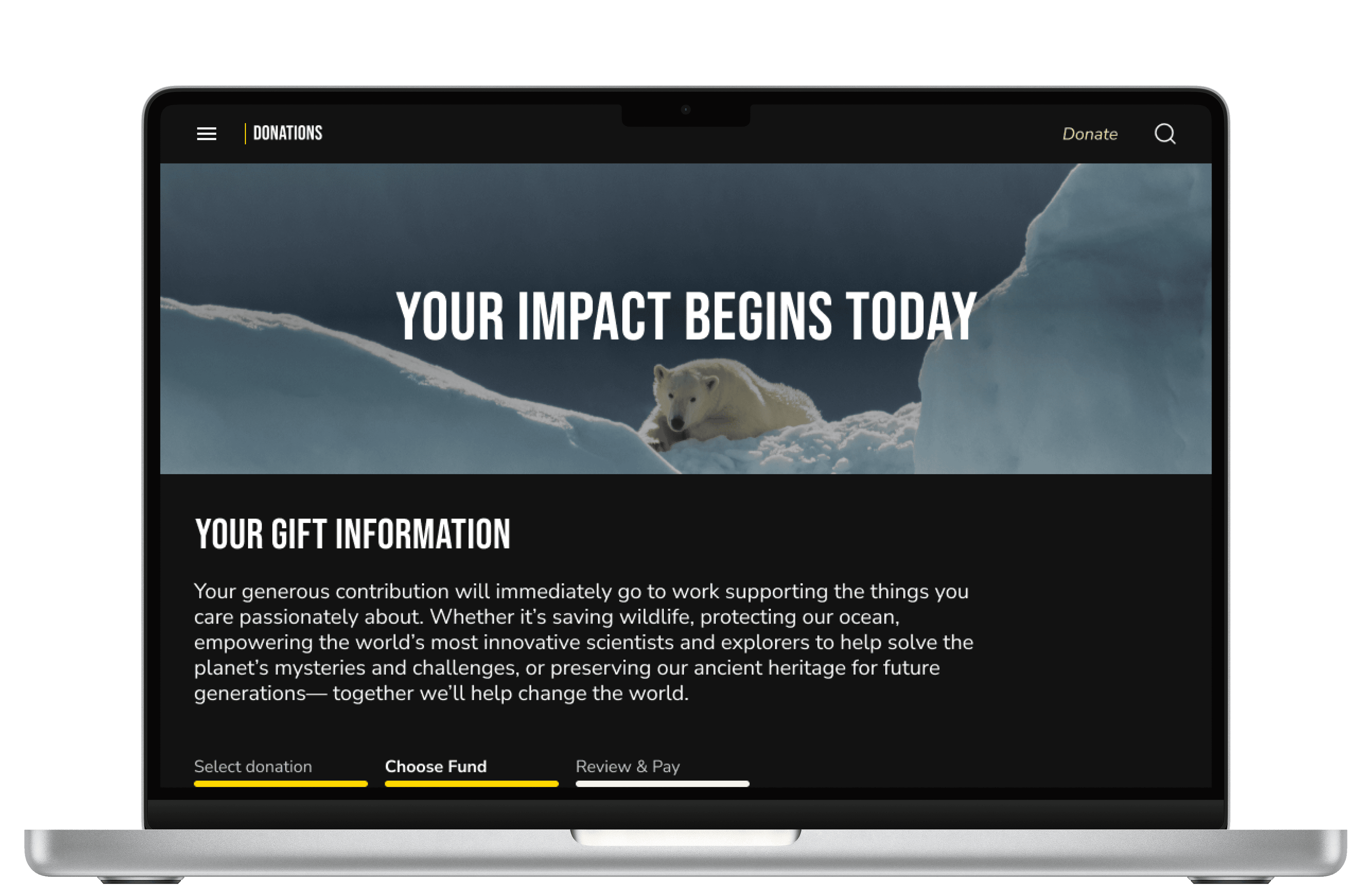

View more of my responsive wireframing process here:
View more of my responsive wireframing process here:
DOWNLOAD
DOWNLOAD


More Works More Works
A.COURTNEY
A.COURTNEY

